
Back to Main Page

SaaS
UI/UX Design
B2B & B2B2C
Industry:
Healthcare / HealthTech
Company:
Apaly Health
Year:
2023
Role:
Senior Product Designer
Market:
🇺🇸 United States
Designing for healthcare means balancing clarity, trust, and operational complexity. Every interface decision directly impacts how people access care.
I led the end-to-end redesign of a Direct Primary Care marketplace platform at Apaly, connecting members, providers, and third-party administrators.
The work included redesigning the visual foundation, core user flows, and introducing new functionalities aligned with evolving business priorities. Rather than isolated screens, the focus was on building scalable and intuitive experiences that could support different stakeholders and implementation stages.
Partnering closely with product and engineering, I translated strategic requirements into cohesive interfaces, improving navigation clarity, reducing friction in key journeys, and preparing the platform for future expansion.
Project Overview
Understanding the Ecosystem and Its Complexity
Apaly operates as a multi-sided healthcare marketplace where each actor plays a distinct role, from DPC providers managing subscriptions to members discovering eligible care. The main challenge was translating complex healthcare structures into clear, actionable product experiences.
My Role
Responsibilities
- →End-to-end product design across three portals
- →Information architecture & interaction design
- →Design System structuring in Figma
- →Cross-functional collaboration with PM & Engineering
- →Translating business logic into UI patterns
- →Prototyping & stakeholder alignment
The Problem
Navigating a Complex Multi-Actor Ecosystem
Restructuring a healthcare marketplace for three distinct user groups - each with different mental models, permissions, and goals - required untangling overlapping workflows and creating coherent, role-specific experiences.
Fragmented Portals
Three separate portals with inconsistent patterns, forcing users to relearn interactions across interfaces.
Complex Eligibility Logic
Plan rules, coverage constraints, and subscription tiers were deeply technical and invisible to end users.
No Shared Foundation
Lack of a design system meant that visual updates required rework across all portals individually.
Multi-Stakeholder Alignment
Business, product, and engineering teams each had competing priorities, requiring constant design advocacy.
The real design challenge wasn't aesthetic, but systemic: making invisible logic feel intuitive.
Design Process
Structuring Scalable Experiences Across Multiple Portals
Discovery
Ecosystem Mapping
Mapped all three portals (Member, Provider, TPA) to identify overlapping flows, inconsistencies, and friction points across user roles.
Stakeholder Alignment
Facilitated working sessions with PM and engineering to align on business rules, technical constraints, and user workflow priorities.
Strategy
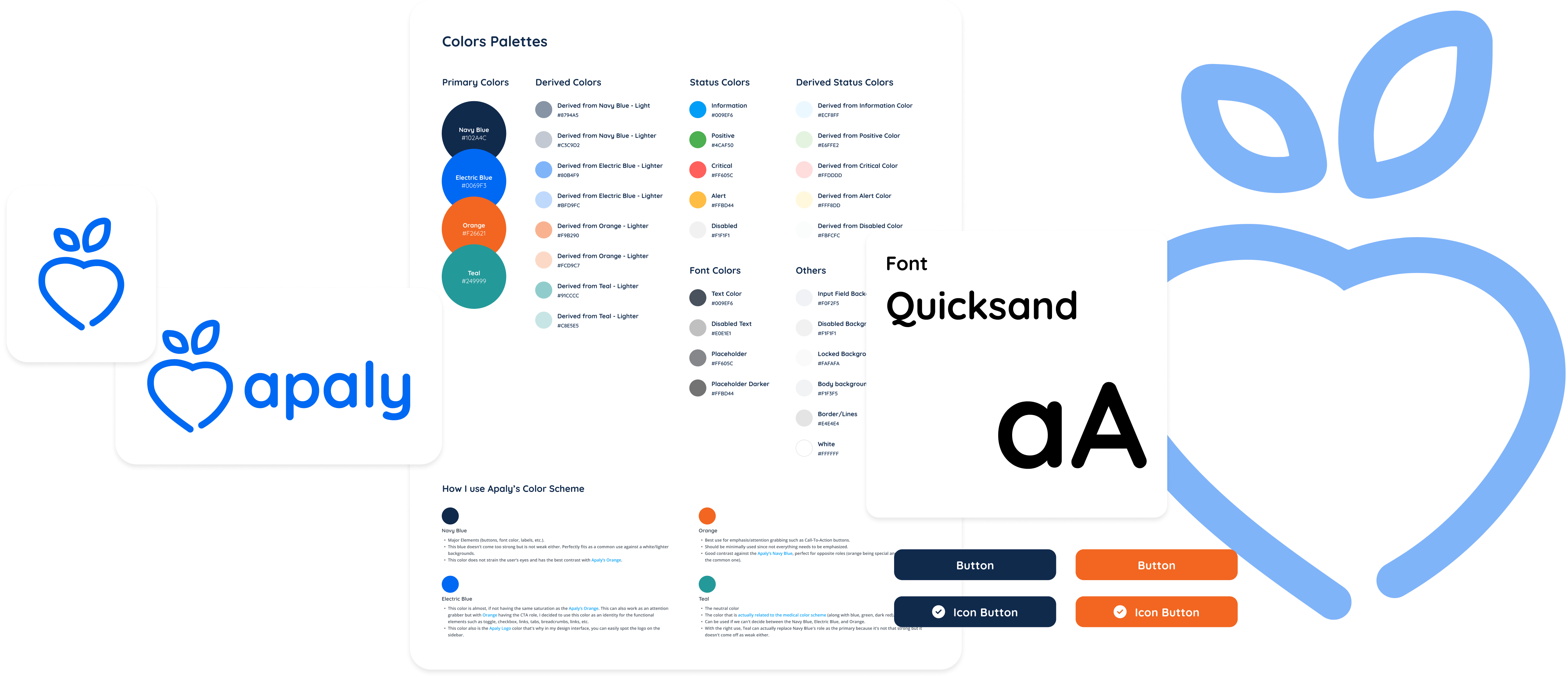
Design System Foundation
Initiated a shared Figma Design System defining foundational components, layout rules, and patterns used consistently across all portals. This system became the interface backbone of the platform, ensuring consistency as new features and audiences were introduced.
Information Architecture Restructure
Redesigned the information architecture of each portal to reflect user mental models, moving from technical logic to task-oriented navigation and reducing cognitive load for non-technical users.
Execution
Member Marketplace Design
Designed the discovery experience for members (filters based on eligibility, coverage, and preferences) translating plan logic into clear, trustworthy choices. The marketplace layer simplified access to care within a highly operational ecosystem.
Provider & TPA Portal Redesign
Redesigned subscription management for providers and plan configuration for TPAs, aligning complex backend logic with intuitive, role-specific front-end interactions.
Design Principles
Guiding the Work
01
Simplify complex healthcare logic into clear UI patterns
02
Create reusable components that scale across all portals
03
Maintain consistency between discovery and plan configuration flows
04
Reduce cognitive load for non-technical stakeholders
05
Build trust through predictable interactions and transparent information
06
Structure by portal to improve coherence and scalability
Outcomes
Impact of the Redesign
3
Portals redesigned end-to-end
1
Unified Design System in Figma
↓
Friction in subscription activation flows
↑
Consistency across all user touchpoints
Members
Clearer provider discovery and eligibility understanding reduced confusion during subscription activation.
Providers & TPAs
Redesigned management flows aligned backend complexity with simple, role-specific interfaces.
Key Takeaways
This project reinforced that systemic design thinking, rather than feature-by-feature execution, is what enables complex products to grow without accumulating friction.
In healthcare, trust emerges from predictable interactions and transparent information, not from visual polish alone.
- →Multi-actor ecosystems require clarity over feature density
- →Strong PM–Design–Engineering alignment is critical when translating complex business logic
- →Structuring work by portal improves coherence and long-term scalability
- →Early Design System structuring accelerates future branding and feature changes
Overall, the project showed how structuring interfaces can systemically simplify access to care, while aligning business operations, provider workflows, and patient needs within a single platform.
More Projects

EdTech
Rebuilding an AI product to reduce time to value by 50x
Redesigning the user journey to accelerate activation, improve conversion, and unlock growth

Media Tech
AI-powered Kids Learning App
Balancing playful learning for children with insights and control for parents

Chat-commerce
Design System Restructuring
Creating a single source of truth for scalable product design