
Back to Main Page

Design System
UX Strategy
Cross-team Collaboration
Industry:
Chat-commerce
Company:
OmniChat
Year:
2024
Role:
Senior Product Designer
Market:
🇧🇷 Brazil
"Design systems are not just about components, they are about creating shared foundations that allow teams to build faster, collaborate better, and scale products with consistency."
OmniChat is a SaaS platform that enables businesses to manage customer conversations across channels such as WhatsApp, Instagram, and live chat.
With multiple squads working on the product simultaneously, maintaining interface consistency and scalable UI patterns was essential for the product to evolve efficiently.
When I joined the company, the design team had already started an initiative to update the design system, but the project had not been completed, and the system lacked a clear structure.

Project Context
A system in flux
The design system was split across two Figma files — a legacy version and a newer one that had never been fully implemented. Designers frequently had to confirm where each component should come from, which slowed down the design process and introduced risk.
My Role
Responsibilities
Challenges
Identifying the problem
During onboarding, I mapped the structural issues affecting the design workflow. The fragmented system created confusion, duplicated effort, and slowed delivery across teams.
No single source of truth
Components existed in two separate Figma files: a legacy system and a new version that was never fully completed.
Inconsistent documentation
Docs were created at different times by different designers, with varying levels of detail and structure.
Design–Engineering misalignment
Some components existed only in design; others only in code. There was no shared understanding of what was ready.
Risk of divergence
Designers were likely to detach components or create variations outside the system, further increasing inconsistency.
This lack of clarity slowed down the design process and made it harder to maintain a consistent interface across the platform.
Process
How we approached the restructure
Discovery
Component audit
I worked closely with the other designers to review the status of each component across both Figma files, identifying what needed to be updated, rebuilt, or created from scratch.
Team alignment
Through conversations and collaborative reviews, we surfaced duplicated components, undocumented patterns, and misalignments between design and engineering - building a shared picture of the system's current state.
Strategy
Single source of truth
We consolidated the design system into a single Figma file, eliminating ambiguity about which components should be used across the product.
Documentation standard
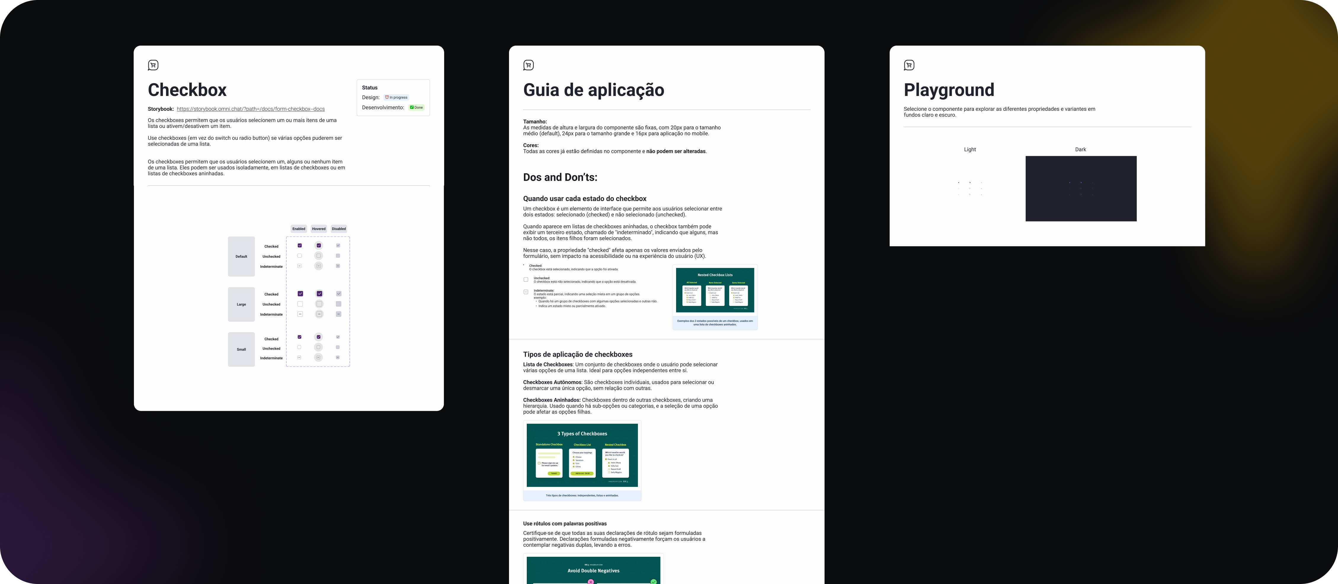
I introduced a documentation template to ensure every component provided the same type of information: usage guidelines, variants and states, interaction behavior, and implementation status.
Execution
Strategic component roadmap
Instead of rebuilding everything at once, we created a roadmap to prioritize components based on product needs and upcoming development work, letting the design system evolve alongside the product.
Biweekly syncs
We held regular meetings with designers and developers to review progress, validate component behavior, align on implementation priorities, and discuss feedback, keeping both teams moving together.
Accessibility & Brand
Expanding the system's foundation
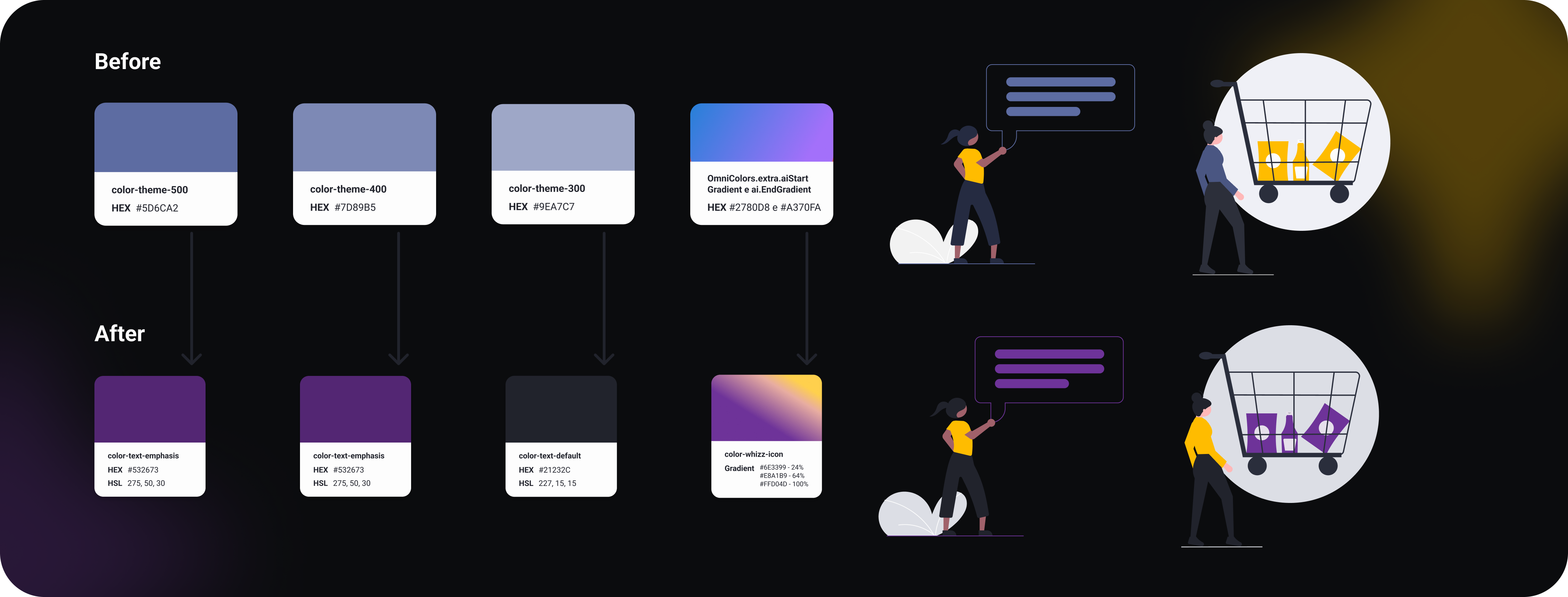
During this initiative, the company was also exploring updates to its brand color palette. We used this opportunity to finalize the primary color system, validate contrast ratios, and ensure accessibility standards were met before rolling out the new palette across components.
01
Color palette finalized
Established the primary and secondary color tokens across the design system.
02
Contrast ratios validated
All key color combinations were tested against WCAG AA accessibility standards.
03
Consistent rollout
Visual updates were applied uniformly across components, improving both accessibility and brand cohesion.
Outcomes
From fragmented to foundational
By the end of the initiative, the design system had evolved from a fragmented resource into a reliable foundation for the product team.
1
Single source of truth for all UI components
5+
Phases in the component roadmap
2×
Biweekly syncs with design & engineering
100%
Components with standardized documentation
More efficient design workflows
With a clear single source of truth and standardized documentation, designers spent less time searching for the right component and more time building.
Easier onboarding for new designers
Structured documentation and a consolidated file made it significantly faster for new team members to understand and use the system independently.
Junior designers
Actively contributed to component creation, using the initiative as a learning opportunity to develop stronger interface design practices.
Cross-team collaboration
The initiative strengthened alignment between design and engineering, creating a shared culture of ownership around the system.
Key Takeaways
What this initiative taught me
Restructuring a design system is less about components and more about people: building trust, aligning mental models, and creating shared ownership across teams.
"A design system becomes truly valuable when the whole team feels ownership over it, not just the person who maintains it."
This initiative reinforced that clarity and collaboration are prerequisites for scalability. Before adding new components, you need everyone to agree on what already exists, and why it matters.
The design system became not just a library of components, but a tool that helped the team build and scale the product more effectively, and a shared language that designers and engineers could rely on every day.
More Projects

EdTech
Rebuilding an AI product to reduce time to value by 50x
Redesigning the user journey to accelerate activation, improve conversion, and unlock growth

Media Tech
AI-powered Kids Learning App
Balancing playful learning for children with insights and control for parents

Healthcare / HealthTech
Healthcare Marketplace Platform
Simplifying a multi-actor healthcare ecosystem